
CASE STUDY - COFFEYS TOURISM PROPERTY BROKERS
Coffeys is New Zealand’s first nationwide company that specialises exclusively in tourism property. After operating for more than 35 years,
they realised their logo was old, dated and in need of a redesign — but they wanted to somehow keep a connection with it too.
 Jon Tarr - Design Commentary
It was important that the new design was an obvious progression of their historical identity. At the same time I wanted to capture an ‘essence’ of the following keywords: New Zealand; Property; Land and Landscape; Investment, Trade, Brokerage.
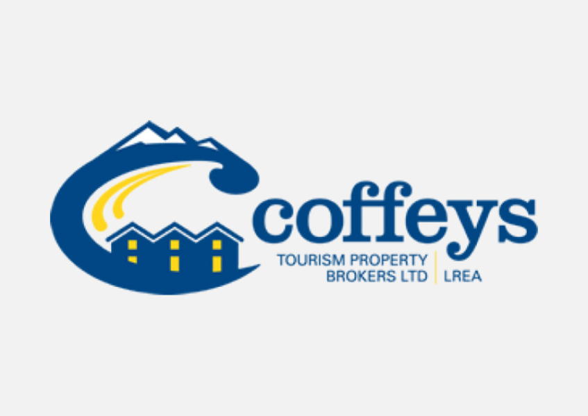
This was their historical logo which they were no longer happy with, but didn't want to leave completely. So I had to find some continuity to carry forward.
I identified that the curved serifs on the lettering had become an iconic part of the brand. But the slab-serif type no longer suits modern uses like tiny web adverts and mobile browser windows.
The size and placement of the graphic takes up over 40% of the overall logo. Causing imbalance and readability issues. The graphic is also too complex and tries to do too much.
Our concept images included New Zealand scenes; Mountains, Koru shapes.
A rising sun symbolises - an event horizon - a future investment - the gleam of gold!
Coffeys is the only firm in NZ dealing elusively with tourism property. So the logo needed a New Zealand landscape feel to it. It needed to say New Zealand, tourism scenery and monetary investment. All in a simple and versatile logo.
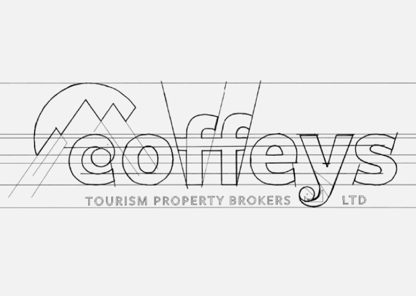
I redesigned the type from scratch. Removing the slab-serifs for a simpler, bolder and modern look. But I emphasised the curved, ‘koru’ serifs on the C and the Y. This retained a sense of brand continuity from the old logo.
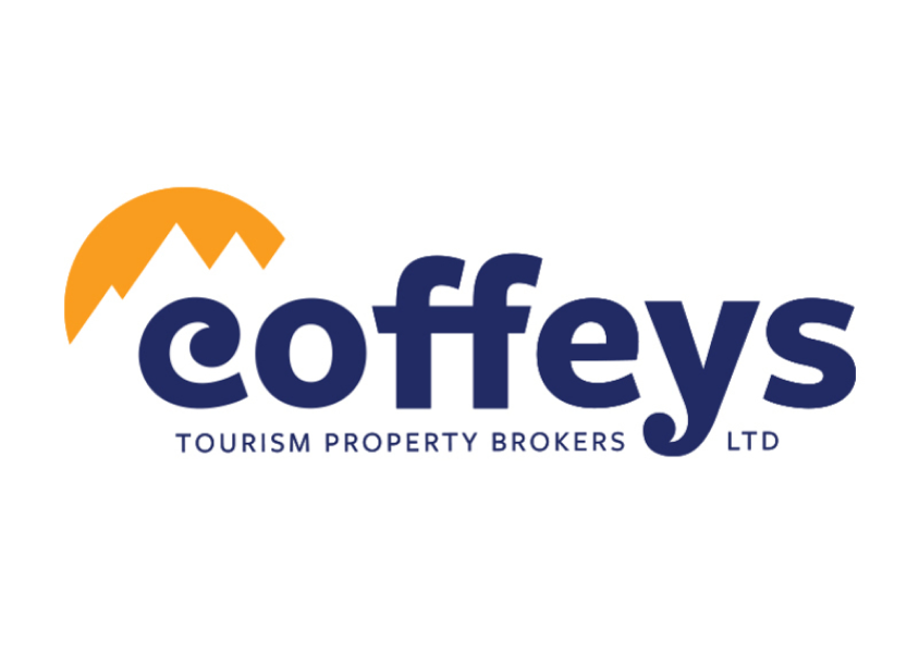
To catch the eye, I designed a simple, abstract graphic to compliment the type. A mountain silhouette cut over a golden circle. Like a bite out of a gold coin. Symbolic of two key themes; Landscape - the sun rising over mountains, a common feature of NZ tourism scenery. And to a lesser extent: Investment - buying and selling value graph / chart.

The result is a simple, bold, eye-catching and memorable logo. Which scales nicely on a full range of digital devices and
is produced consistently in print media. The logo has a New Zealand feel, it is corporate but friendly. A nod to their past.
The simple graphic shape attracts the eye.
The mountain-scape rises and falls like the investment market. The rising sun of the buyer is the setting sun of the seller.
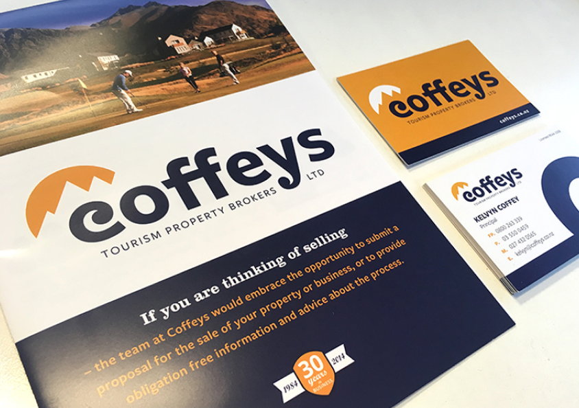
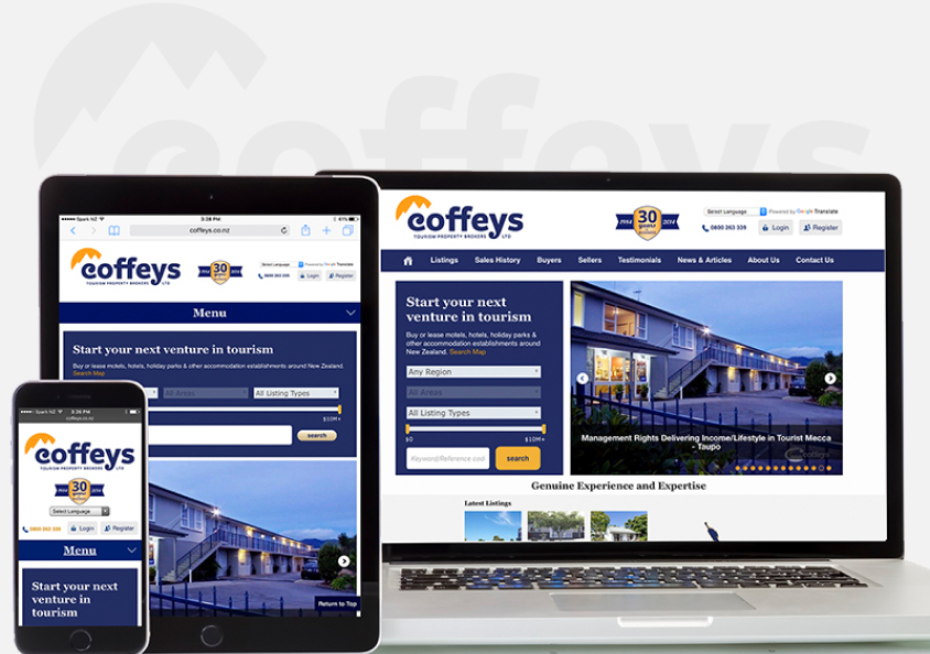
We followed up the re-brand with a range of printed materials, a new website and an animated explainer video
“WOW! What a great change this will be. I think its clean, refreshing and forward looking.”
“We have enjoyed working with you with this. Having a reliable company such as yours in support is very
comforting. You are very quick to respond and do an excellent job, congratulations.”
Kelvyn Coffee, CEO - Coffeys Tourism Property Brokers


