
CASE STUDY - WILCOX & KING
We were approached to design a logo and develop the website for an online high-end gift store; Wilcox & King.
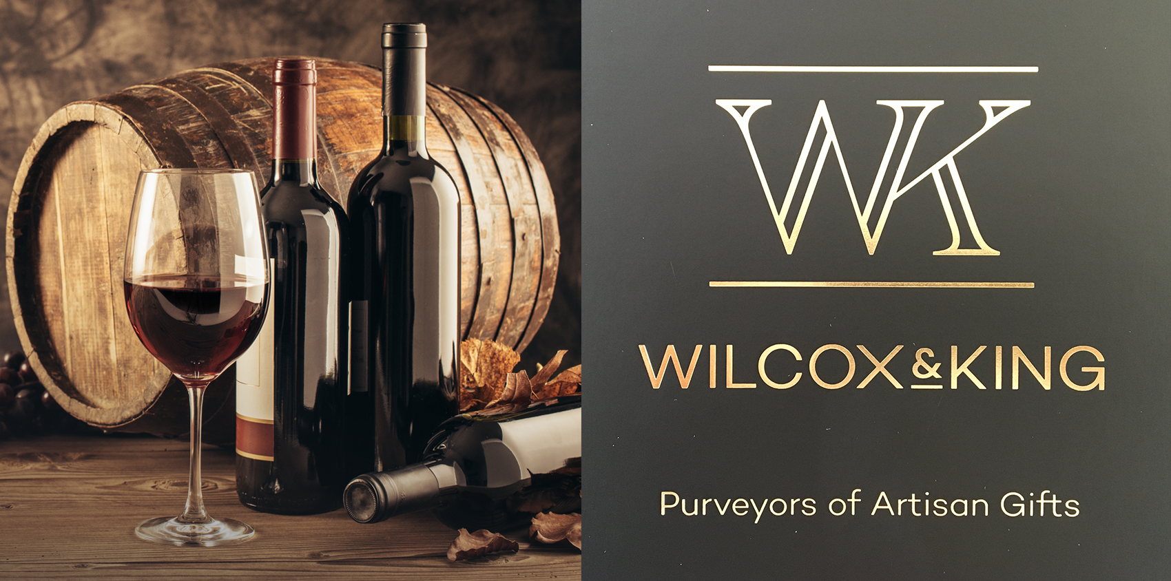
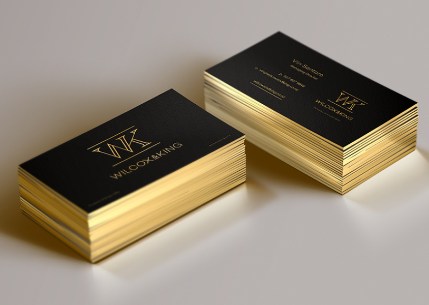
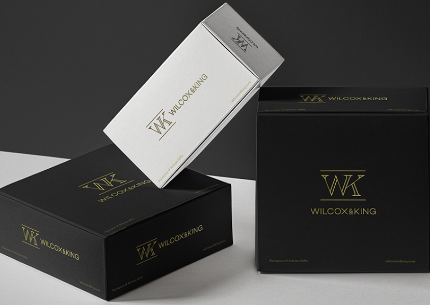
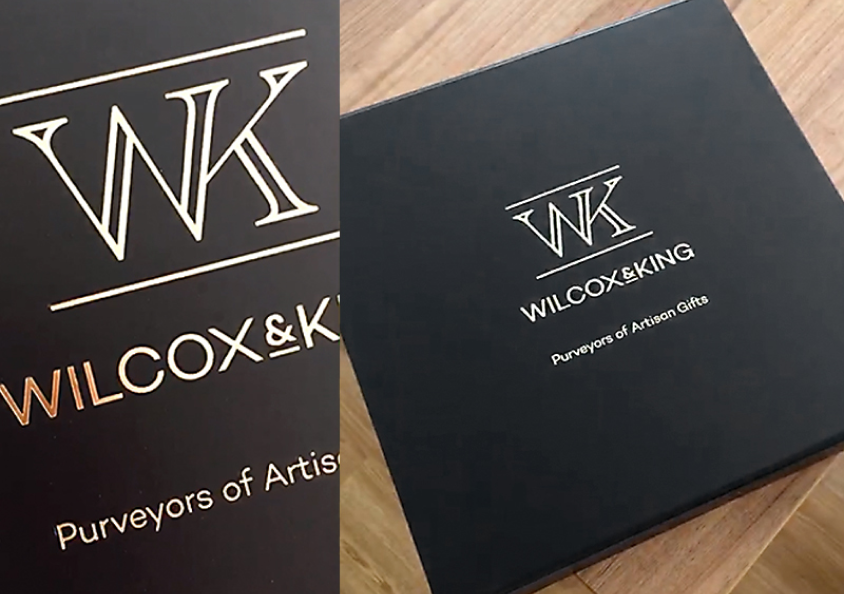
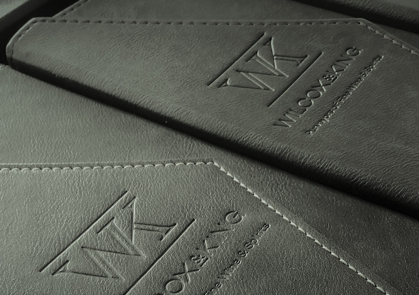
The brief was for a classy, stylish, timeless logo design. Simple, elegant and also well suited for a gold-foil on all their gift packaging.

Jon Tarr - Design Commentary
Bespoke, crafted initials would give this logo a feeling of class and pedigree. Like what might be on the letterhead from a historic, aristocratic, royal family.
But this raised questions as to how to treat the ampersand. It wasn't going to look right if there was two ampersands; 'W&K + Wilcox & King.' Nor would it look right if it was 'W&K Wilcox and King.'
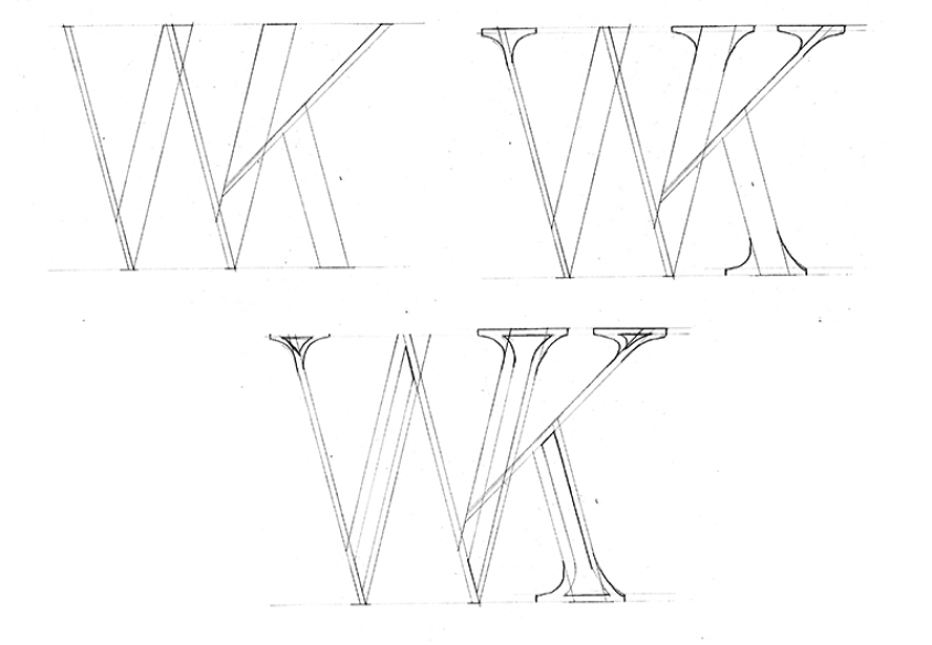
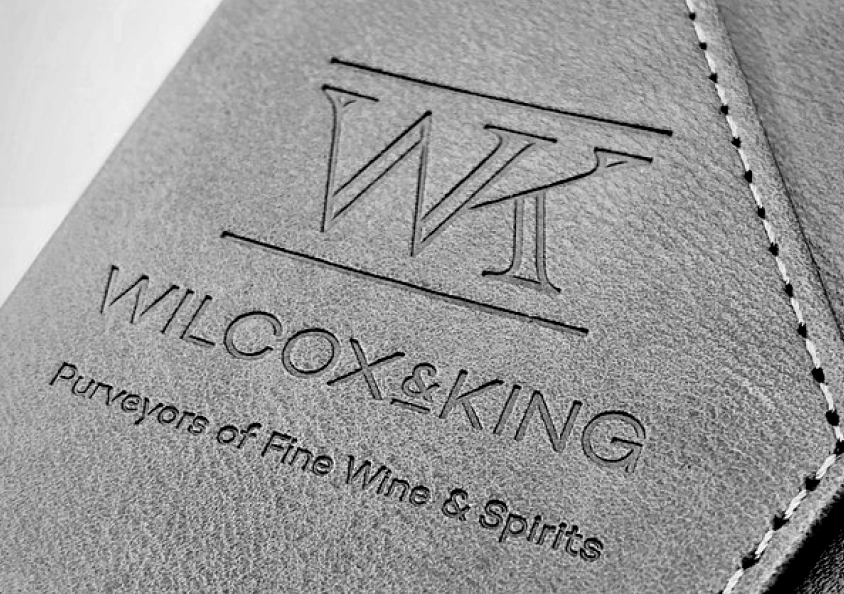
So I decided to combine the letter-forms W and K into a monogram, so there was no need for an ampersand. Avoiding this was preferred as I felt a fancy & symbol was too common, too typical, for this kind of logo.
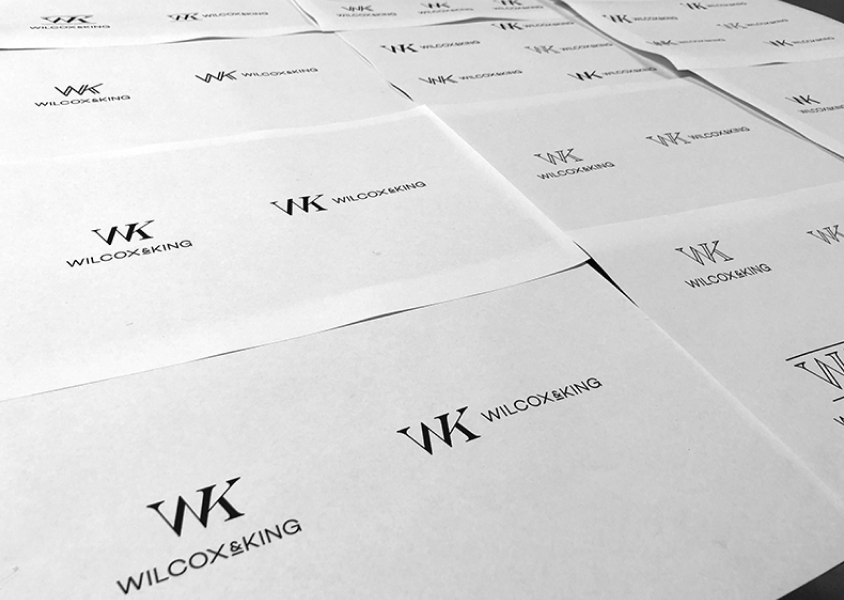
I tried many different formats, lengths and angles. Eventually applying some small serifs to help define each letter-form. This would also give the logo a little bit of age and antiquity.
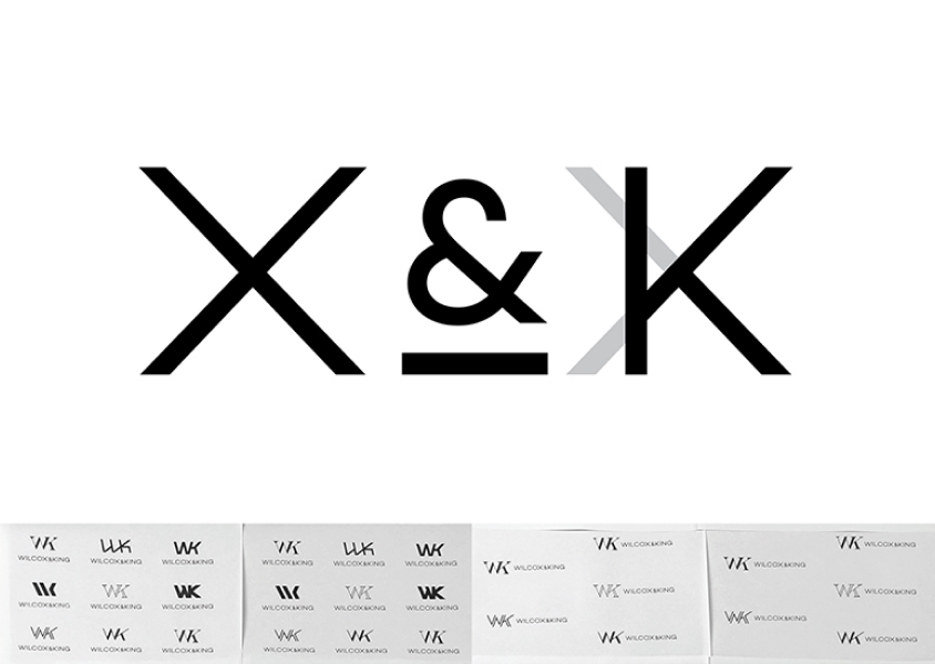
Not to be too faux classical-, it is an online business after all. So the ‘antique’ monogram should be
balanced by some modern sans-serif type. I -paid special attention to the X & K,
making sure that the K was similar in structure to the K in the initials, whist also mirroring the angles of the X. I felt that this
particular part was a focus point and this was a subtle but important aspect to get right.
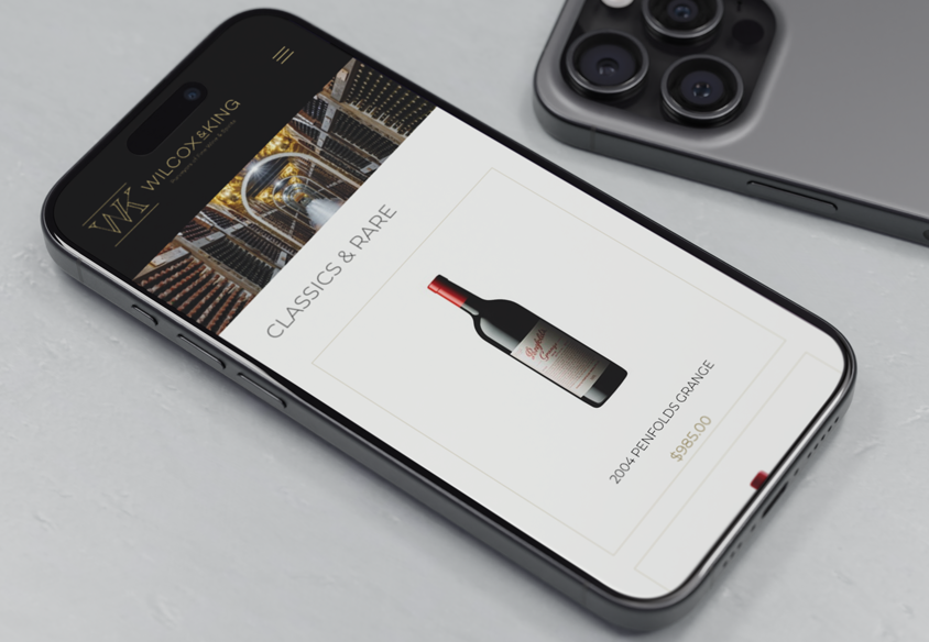
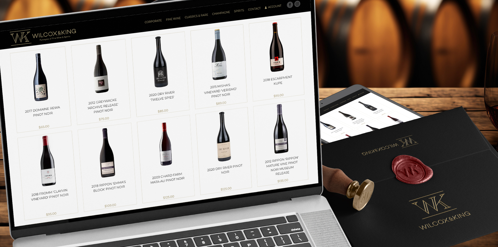
Beyond the logo design, we also designed and developed a stylish and functional e-commerce website. You can check them out here: Wilcoxandking.co.nz


